You have everything a customer needs to know on your website. You've described the service, explained the benefits, added arguments. The text is all there, honest, complete.
And the customer won't read it anyway.
Not because he doesn't care. But because he looks at it like a wall - a continuous block of text that he doesn't want to enter. He runs his eyes over it, finds no clue, and walks away. The content was there. Just in a form that no one reads.
People don't read the web. They scan it
This is the thing to accept: a visitor doesn't read your website word for word. They skim it. He looks for headings, highlighted areas, bullet points, images - clues to orient himself and decide if it's worth reading more.
When he encounters a continuous wall of text without structure, he has nothing to hold on to. It's exhausting and the brain simply says, "too much work, I'm going somewhere else." Even if it was interested in the content.
That's why layout doesn't matter for beauty's sake. It matters because it determines whether the customer will get to the content at all.
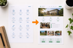
What makes a page readable
It's not about adding more graphics. It's about giving structure and rhythm to the content:
- Blocks instead of solid text. Divide the content into sections where each addresses one thing.
- Headlines that carry a message. So that the customer can just read them and understand the main idea.
- Layout alternation. Text on the left, image on the right, then the opposite, then something highlighted. The eye has nowhere to jump and the page does not look monotonous.
- Air. The gaps between elements are not empty space. They give the eyes a rest and separate thoughts.
In this way, the same content that no one has read before becomes something that can be gone through and understood in a moment.
Here's the catch.
This sounds easy until you try it. Laying out the page so that it has a rhythm, guiding the eye across the page, deciding what to highlight and what to suppress - it's a job that looks easy but isn't. It involves a lot of decisions that a person without practice won't do well. Either he'll overdo it and chaos will ensue, or he won't do it at all and a wall of text will remain.
It's not about "putting up some pictures". It's about putting the page together in a way that leads the customer where they need to go - and that's different than pretty graphics.
See your website through the eyes of a scanner
Open your own page and don't read it. Just run your eyes over it, like a visitor does. You got something to hold on to? Are the headlines leading you? Or is it a coherent text that you don't want to go into yourself?
If a wall of text prevails, there's a reason why the site isn't bringing in as many inquiries as it could - no matter how good the content is.
This is one of the things I deal with on corporate websites - how to lay out the content so that the customer will actually accept it. When you want to know where your site is losing attention, I'll look at it with you and suggest specific adjustments.
Michal Šanca - I design websites so that they lead the eye and the customer's decision, not just look nice.