Creating a school website usually starts the same way. The school management agrees that the website is outdated, cluttered and looks old. The decision is made: let's get a new one. A company is chosen, an order is signed, a few months are spent waiting - and then the new website arrives.
Nicer. More modern. And the parents are behaving exactly the same as before.
This is the most common disappointment I see with school websites. Not that the new site is bad. But the school was expecting it to make a change that a new website can't make on its own.
Why a new website alone is not enough
When people say "we need a new website", they almost always mean the look. Different graphics, more modern fonts, bigger photos. That's understandable - the look is the first thing that hits the eye.
But a parent doesn't make a decision based on how pretty a website is. It's based on whether they can quickly find what they need, whether they understand what makes the school different, and whether they feel like they can trust the school with their child.
And these are things that the new graphics don't address.
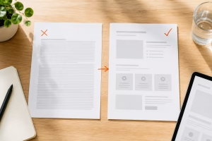
When a company is given a "make a new website" brief, they usually take the old content and put it in a new coat. The same text, the same menu structure, the same information organized by ordinance instead of what the parent is looking for. The site looks new, but works the same inside. The weak spots remain - they're just in a nicer package now.
Sometimes it's even worse. Because "it's new, so it's done" - and nobody goes back to it for years.
What a parent actually does on the school website
Here's the thing that schools rarely realize: a parent doesn't browse your website. They scan it.
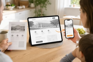
He won't read twenty paragraphs or scroll through a thirty-item drop-down menu to piece together a picture. He'll open the site most nights, on his mobile, between two other things. He wants to absorb the essentials in a few seconds. What he doesn't find quickly, it's like it's not there - even if you have it on the site.
And this is where the decision is made. Not by color. It's whether the web will carry him through in a moment:
- Will they immediately understand how your school is different from the one next door?
- Can he quickly find what he is interested in - enrolment, deadlines, documents, contact?
- Do they see how things work in your country and how you approach your children?
- Does he know what to do as a next step?
If a site can't handle this, it doesn't help that it's new. And if it can do that, it often doesn't need to be new at all.
Creating a school website should not start with graphics
The order in which a school website is usually done is actually reversed. It starts with the look and the structure somehow completes it. It should be the other way around.
First, you need to know who the website is talking to and what that person is supposed to understand and do. The parent of a prospective first grader, the parent who is choosing a high school, the actual student who is reading the web too - everyone is looking for something different. Only when this is clear does it make sense to address structure, text, and ultimately appearance.
Appearance is the final layer. Important, but the last. When it's built first, it creates a pretty website that gets no one anywhere.
That doesn't mean that a new school website never makes sense. Sometimes an old site is technically over, cannot be reasonably modified, or does not meet accessibility laws. Then the new site makes sense. But it still applies: it's what idea goes into it that decides, not what it looks like.
How to know what's really holding your website back
Before you commission the creation of a new school website - or before you invest time and money in it - it pays to find out where the website is realistically losing parents. Because it often turns out that you don't need a new website at all. That you just need to go after specific points: what to edit, what to add, what to remove.
I have therefore prepared a short checklist: 7 things a parent looks for on the school website - and often doesn't find. It will take you through your own website in minutes, through the eyes of a parent who doesn't know you yet. For each point, there is a short explanation of why it matters.
You can download it at page about creating school websites. It is free and without obligation.
And if, after going through it, you find that there are more gaps than you expected, let me know. I'll look at your site through a parent's eyes and we'll work together to suggest what to do about it - either by modifying what you have or overseeing who makes the new site. Without paying for anything unnecessary.
Michal Šanca - I help schools to make their website not just a bulletin board, but to guide parents and students to make decisions. Write to me.